- BoostSolutions
-
Products
-
- Microsoft Teams
- HumanLike Alert Reminder
- View All Apps
- Pricing
- Support
- Company
Business Charts provides a quick and easy way to create charts in minutes in SharePoint environment. Users can create charts using various chart types, including Column, Bar, Line, Area and Pie, enabling better data analysis and more informed business decisions.
This tutorial will demonstrate how to use the product to create a chart or graph.
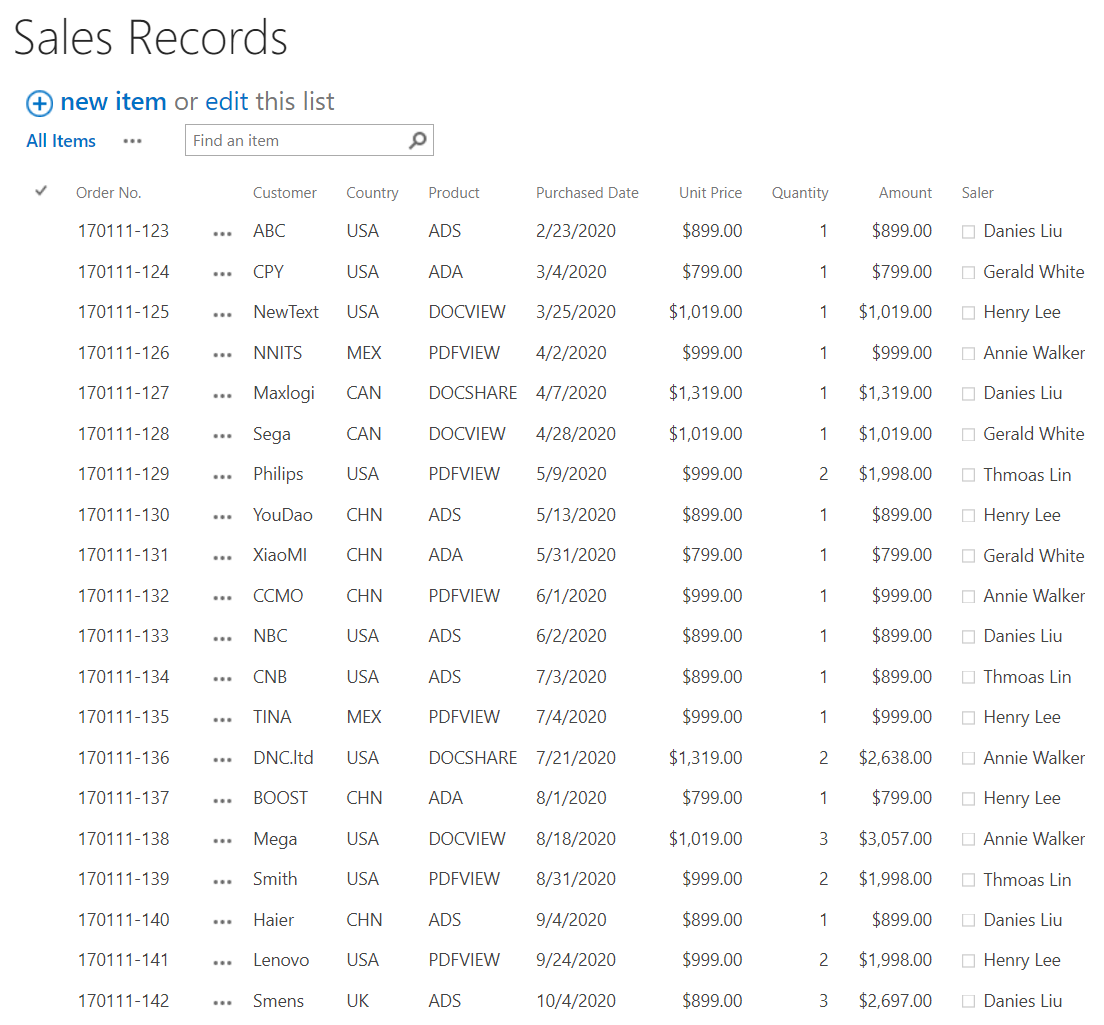
There is a list named as Sales records with following columns and items on a SharePoint site.
BoostSolutions Business Charts allows end users to create chart directly on a SharePoint list. In this tutorial, we will demonstrate how to do it. To complete this task and to view the chart you must have at least Design permission level in the current list.
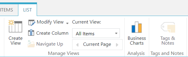
a. Enter the list and click Business Charts under the List tab.
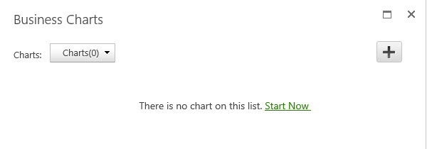
b. If you use the product for the first time, a message may appear indicating that there is no chart on this list. Click Start Now or click  on the right top corner to create your first chart.
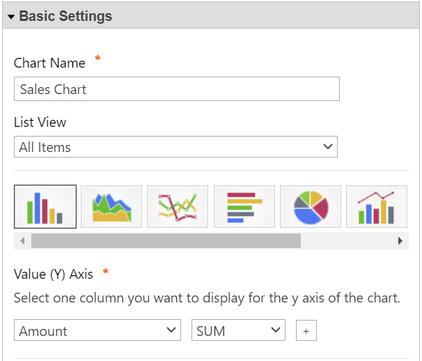
c. In the Basic Settings section, specify a meaningful name for this chart.
d. In the List View section, select one view to decide the data range you want to use to generate a chart. Personal view is not supported.
e. Here we select Column chart. There are 8 types of charts are available: Column, Area, Line, Bar, Pie, Bubble, Scatter and Combo chart. Select one chart type according to your needs or business goals.
f. In the Value (Y) Axis section, you can select a column or field to display on the y axis.
In the Value (Y) Axis section, specify one function you want to apply to the values on the Y axis. Here we select Amount column and select SUM to show the sum of the column.
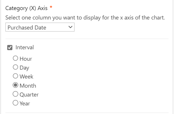
g. In the Category (X) Axis section, select a column or field to display on the X axis. Here we select Purchased Date column, and then you will find Interval section is displayed, select Month in this section. It means showing the sale amount for each month on the graph.
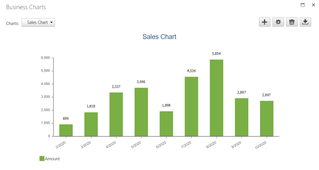
h. Keep other settings as default and click Save Settings.
i. click Close Settings button to close the panel. Then you will find a chart as following.
To add a Business Charts Web Part, you must have at least Design permission level.
a. From any page, click on the Settings icon and choose Settings from the drop-down menu.
b. Click on the page where you want to add the Web Part to and click the Insert tab followed by Web Part.
c. Under Categories, select BoostSolutions Web Parts category. Next select Business Charts under the Web Parts section and click Add.
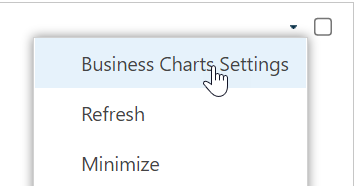
d. Now the Business Charts Web Part is added on page, hover over the Business Charts Web Part to reveal the blue arrow on the top right corner of the web part. Click on the arrow to open a drop-down menu and click on Business Charts Settings.
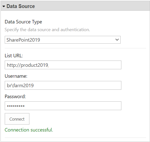
e. In the Data Source Type section, select a data source type and configure the authentication. Here we select SharePoint 2019, enter URL of the above list Sales records and configure the authentication.
f. In Basic Settings section, specify a meaningful name for this chart.
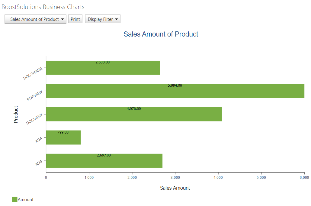
g. Here we select Bar chart.
h. In Value (Y) Axis section, select Amount column and select SUM to show the sum of the column.
i. In the Category (X) Axis section, select a column or field to display on the X axis. Here we select Product column.
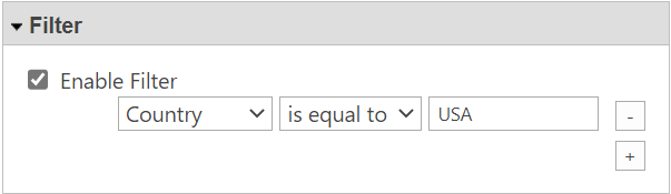
j. In Filter section, select Enable Filter option and set the filter as Country is equal to USA. It means only showing the orders of USA in the chart.
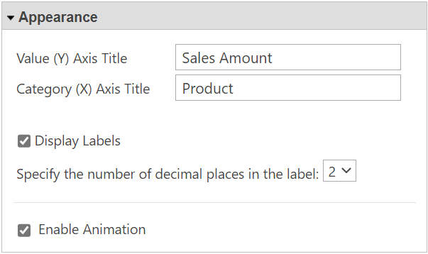
k. In the Appearance section, specify the title for Y and X axis, and then select Display Labels option and set the number of decimal places as 2.
l. Keep other settings as default and click Save Settings.
i. Click Close Settings button to close the panel. Then you will find a chart is created on the web part as following.