Tutorial

Tutorial of Business Charts App

1. Introduction

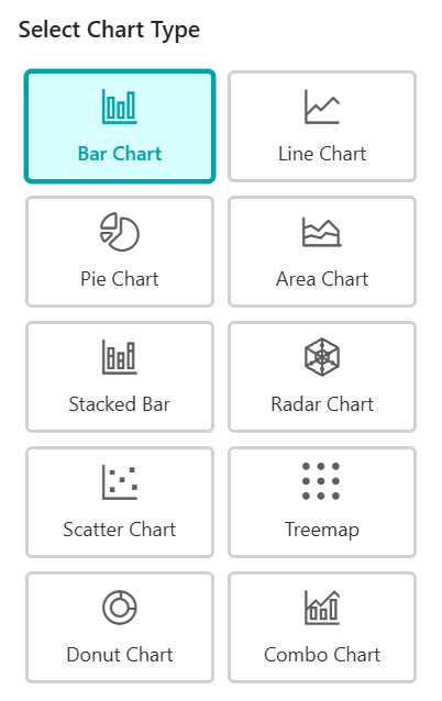
Transforming your SharePoint data into professional visuals is easy with the Business Charts App. This guide will walk you through the entire process.

2. Connect to SharePoint List

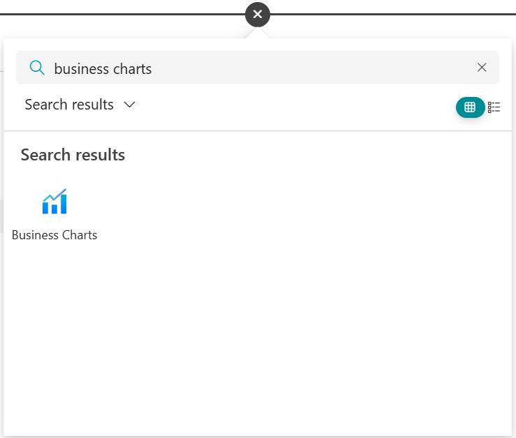
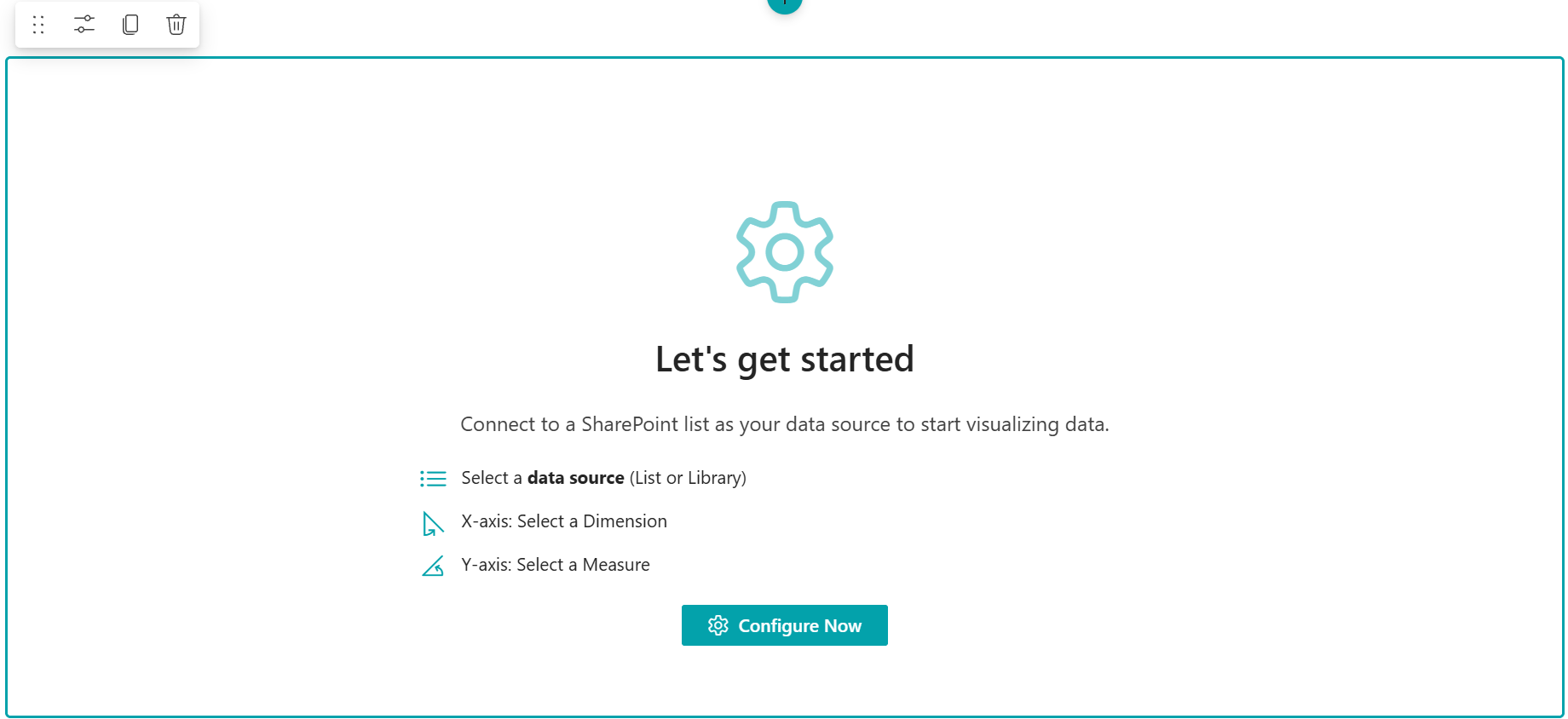
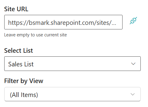
Start by selecting the data source you want to visualize:

  • Add the Business Charts web part to your SharePoint modern page.
  • Click the "Configure Now" button within the web part to open the settings panel.
  • Select the Site and the specific SharePoint List you wish to use.
  • Optional: Choose a List View to apply pre-defined filters to your chart data.

3. Configure Chart Data & Aggregation

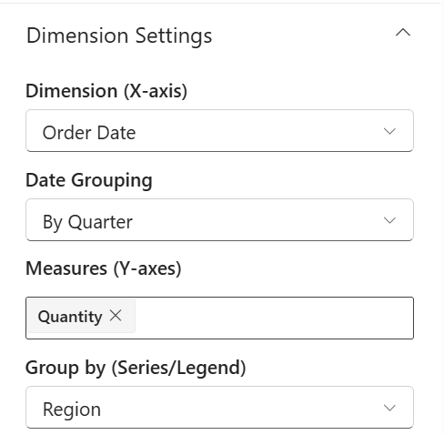
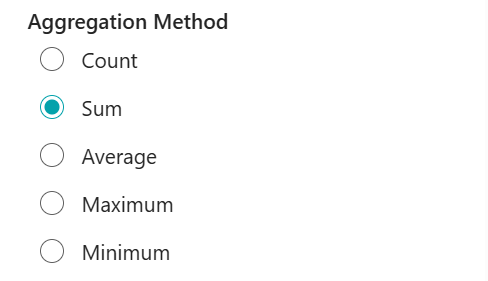
Define how your data is grouped and calculated:

  • Choose Chart Type: Select from 10 versatile types, including Column, Line, Pie, Donut, and Combo charts.
  • Dimensions Settings: Map your list columns to the Category (X-axis) and Series (Y-axis). Use the "Date Grouping" feature to organize data by time intervals (Year, Month, Day). Use the "Group by" feature to organize data by category.
  • Data Aggregation: Perform instant calculations such as Sum, Average, Count, Max, or Min directly within the app.

4. Styling & Customization

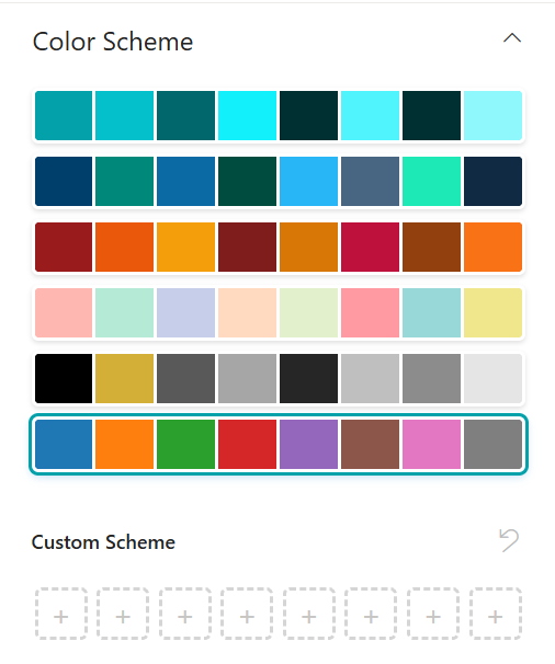
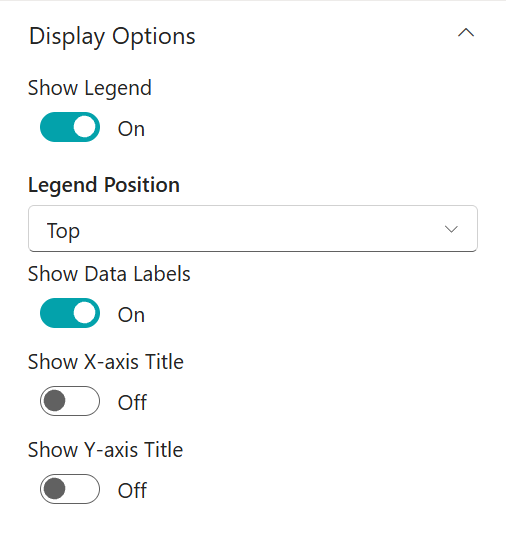
Enhance the visual appeal and readability of your chart:

  • Professional Themes: Select a pre-set color palette in the Appearance tab to match your corporate branding.
  • Data Labels & Legends: Toggle "Show Data Labels" to display values directly on chart elements and adjust the Legend position (Top or Bottom).

Note: After configuration, ensure you click "OK" at the bottom of the panel and "Publish" the SharePoint page to save your changes.

5. Publishing and Exporting

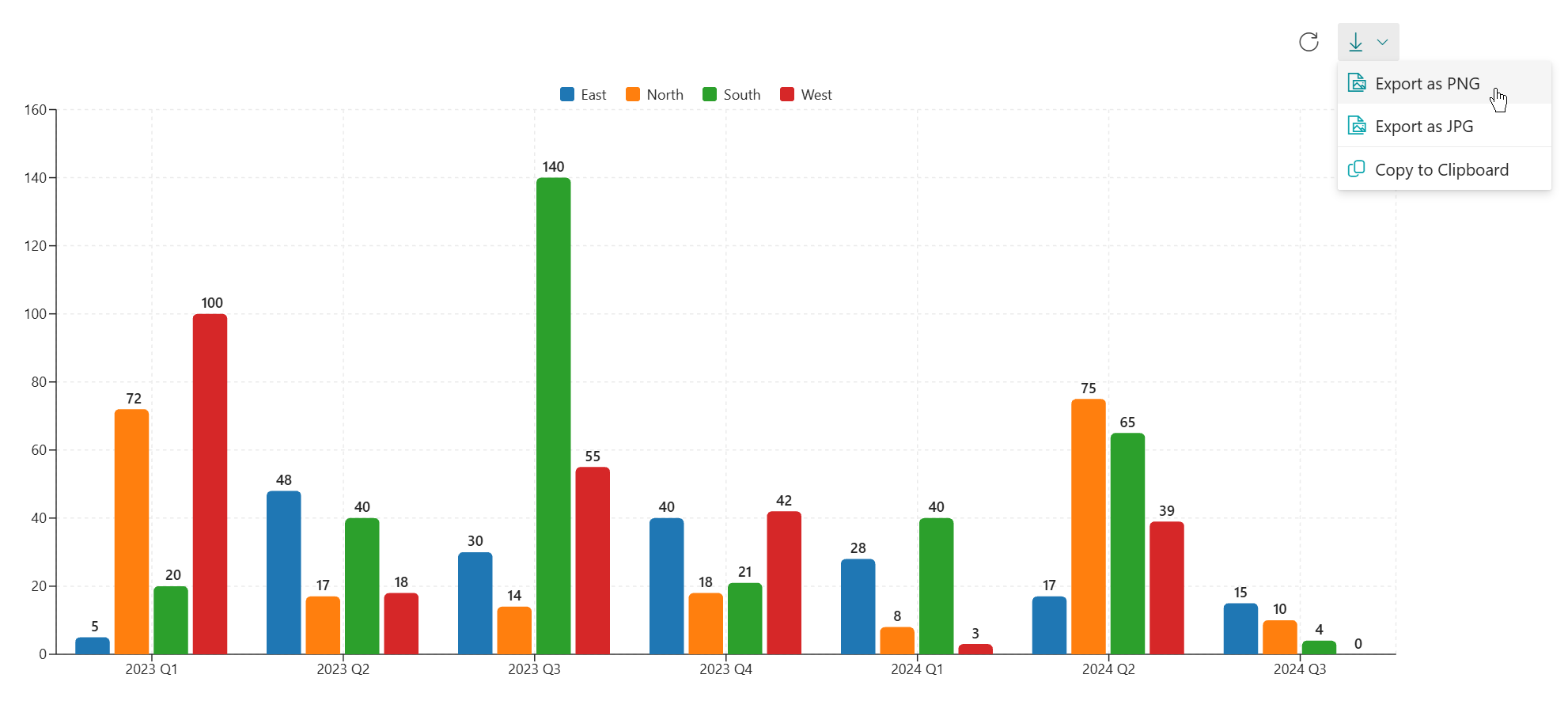
Once published, your chart is fully interactive. You can also export the chart as an image for use in offline reports or presentations.

Start exploring all the features of the Business Charts App

Login