- BoostSolutions
-
Products
-
- Microsoft Teams
- HumanLike Alert Reminder
- View All Apps
- Pricing
- Support
- Company
Transform your SharePoint lists into visual, professional dashboards in 3 minutes. No-code, secure, and perfectly integrated with Microsoft 365 modern experience.
Free 30-day trial. No credit card required.
Visualize SharePoint data in 3 minutes. No coding, no hassle.
Choose the perfect view for your data story.
Stop doing math in Excel. We handle the numbers.
Professional, secure, and built for modern SharePoint.
| Feature |
Business Charts
|
Native Quick Chart
|
Power BI
|
|---|---|---|---|
Setup Time |
3 Min (No-code) |
5-10 Min |
Hours (Dev required) |
Chart Variety |
10+ Types |
3-4 Basic |
Unlimited (Complex) |
Aggregation Logic |
Smart (Auto) |
Basic (Count only) |
Advanced (DAX script) |
Theme Integration |
Native Theme Inheritance (Light/Dark) |
Fixed / Static |
Manual Config |
Maintenance |
Zero-maintenance (No Gateways) |
Minimal |
High (Gateway/Refresh) |
Cross-Site Data |
Supported |
Not Supported |
Complex Setup |
Skill Barrier |
Low (Business User) |
Low |
High (Data Analyst) |
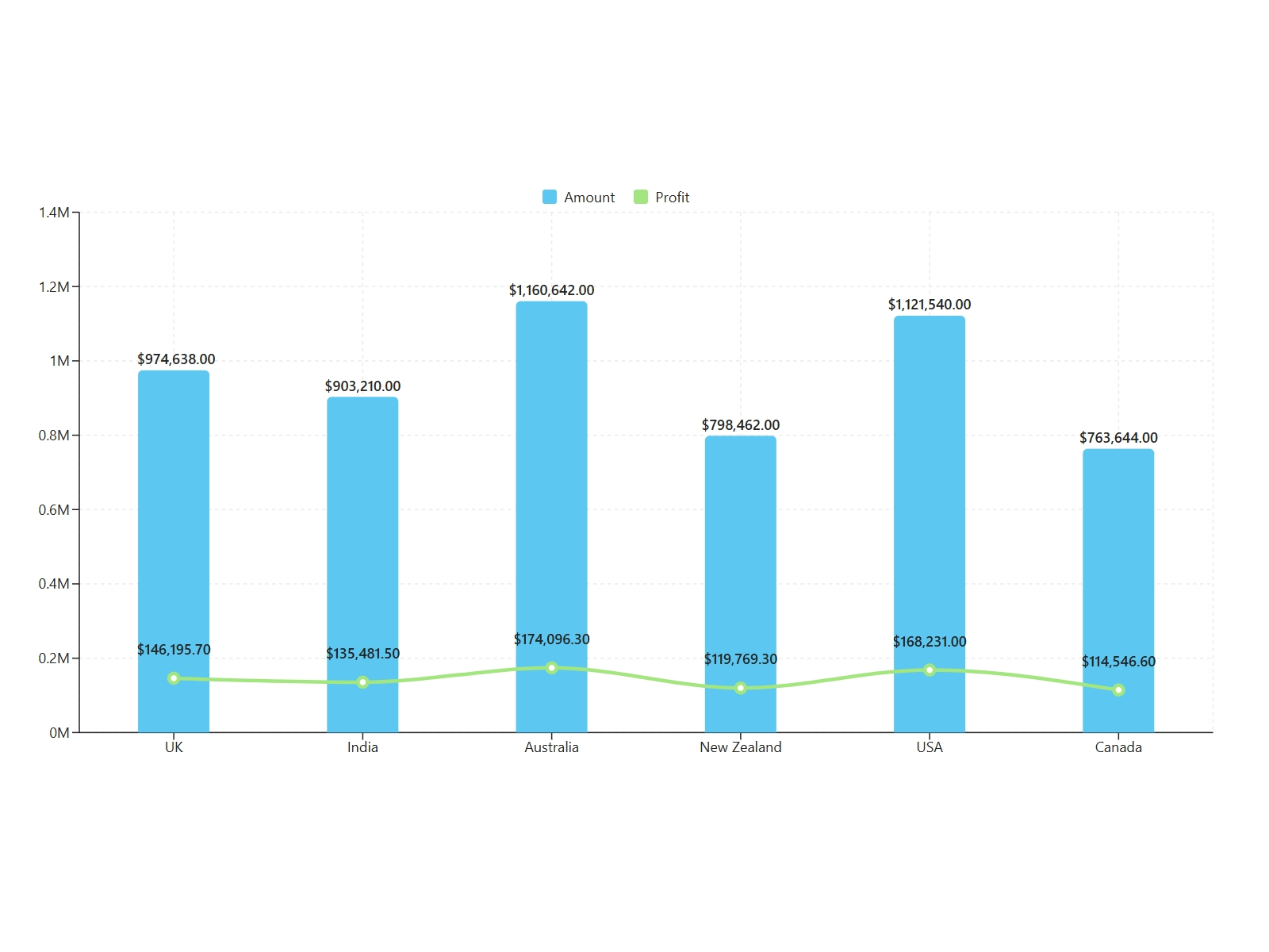
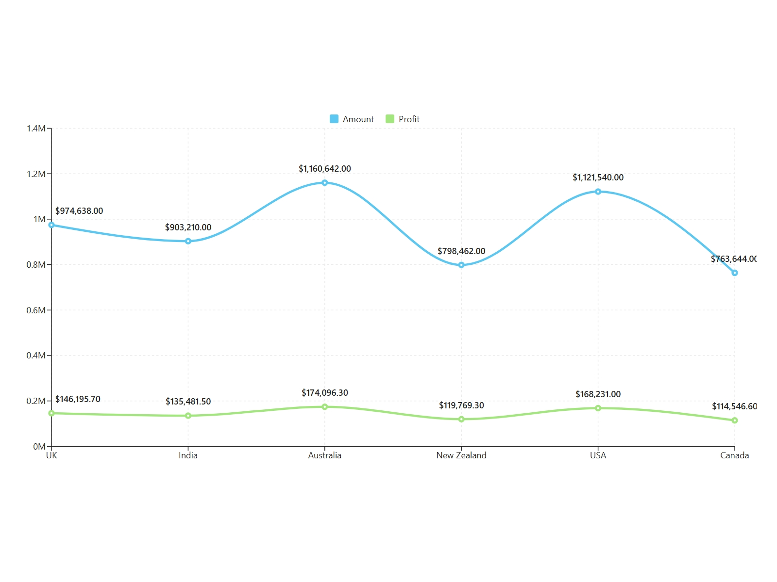
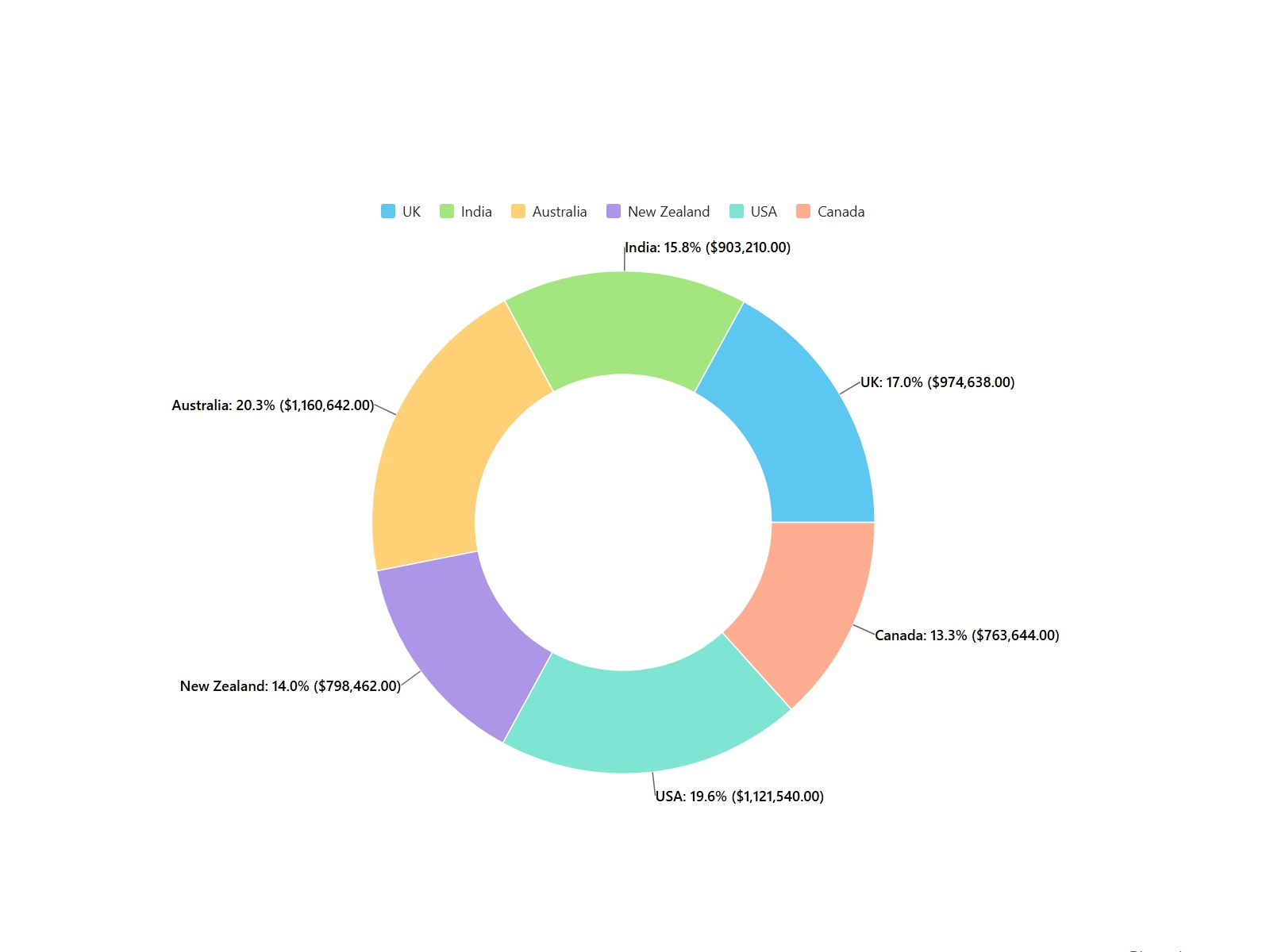
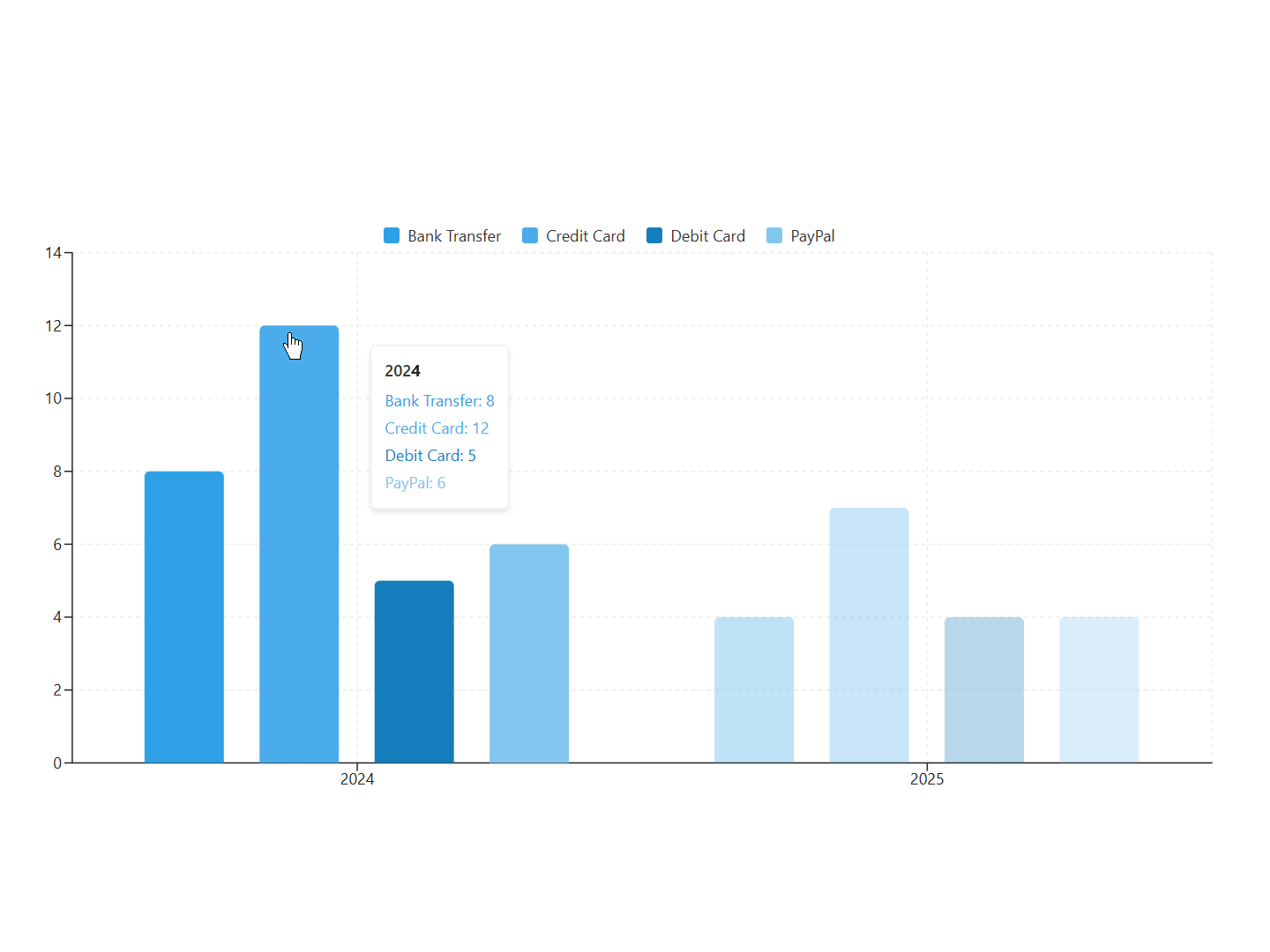
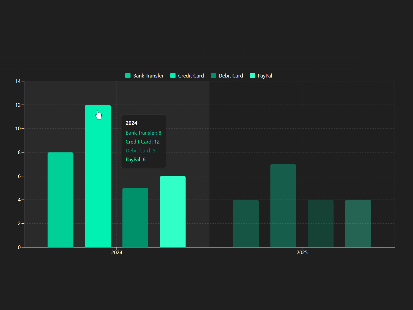
Visualize monthly revenue trends and identify top-performing products by category.
Monitor project milestones and task completion rates across departments.
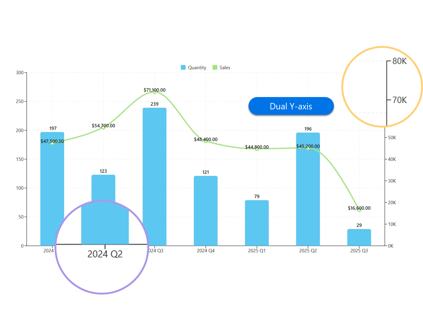
Track actual spending vs. planned budgets with dual-axis visualization.
Manage inventory levels and equipment usage with real-time chart updates.
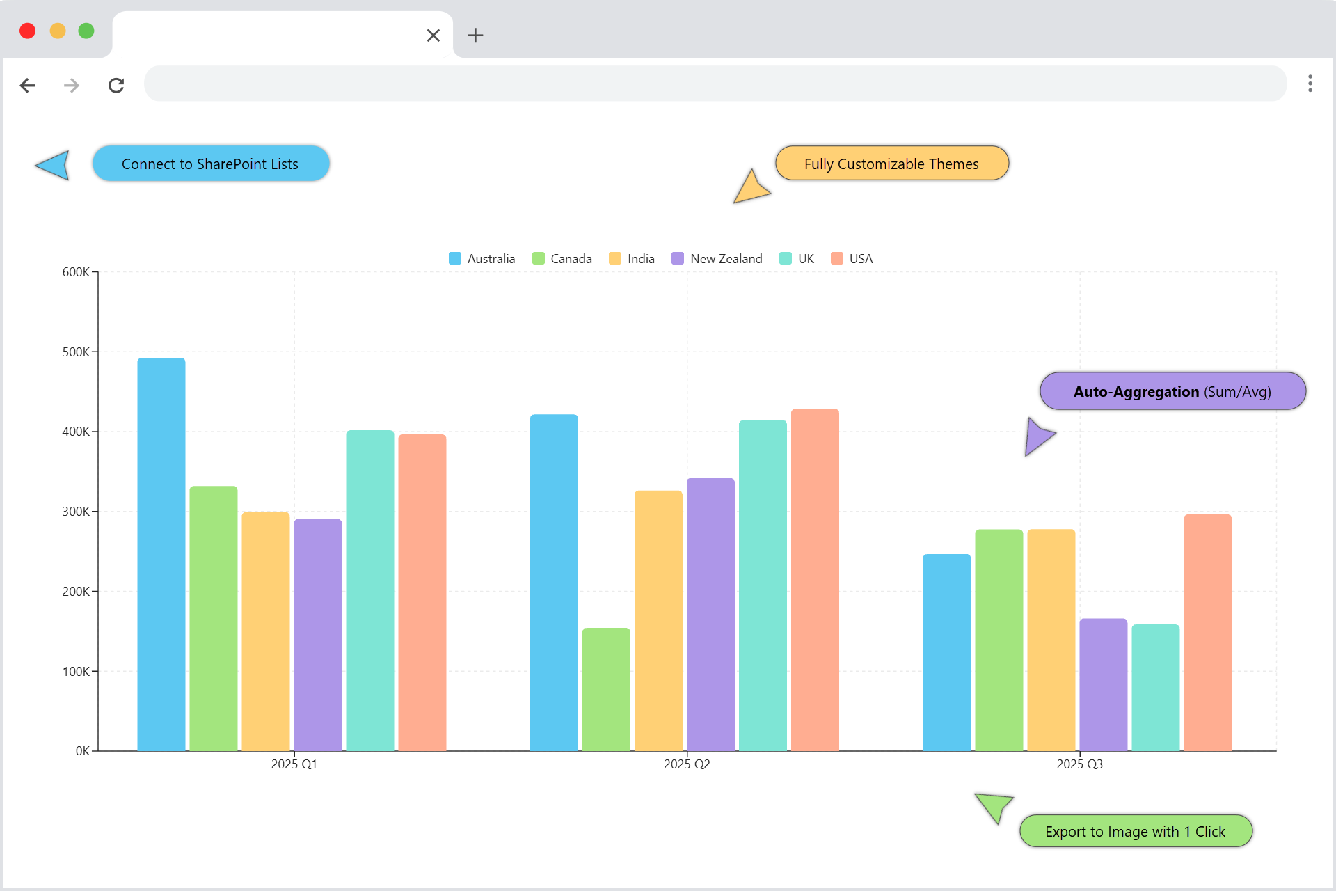
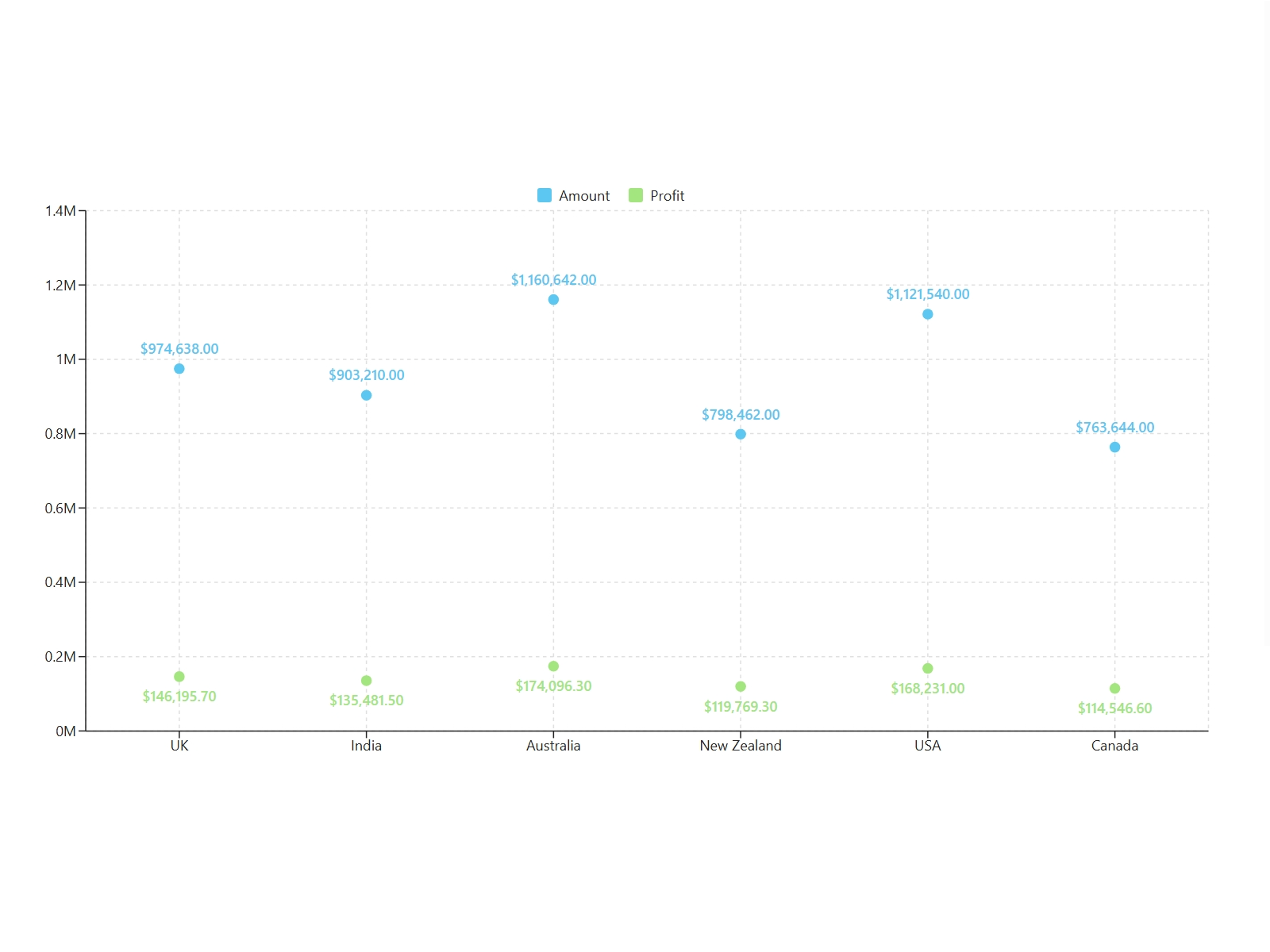
Compare counts, amounts and categories.
Track change over time.
Show how parts of a whole.
Compare two metrics in one view.
Go beyond basics with Radar & Scatter visualizations.
All processing happens in your browser. Sensitive data never touches our servers.
Full compliance with your existing SharePoint and Microsoft 365 permission models.
Optimized SPFx framework that keeps your modern SharePoint pages running smoothly.
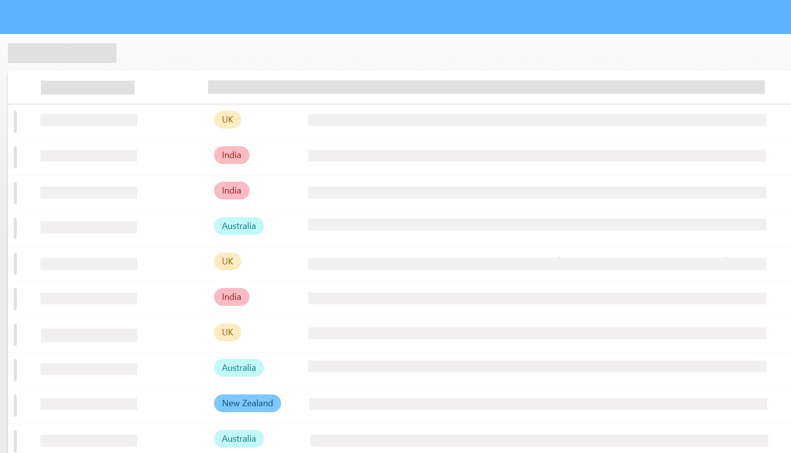
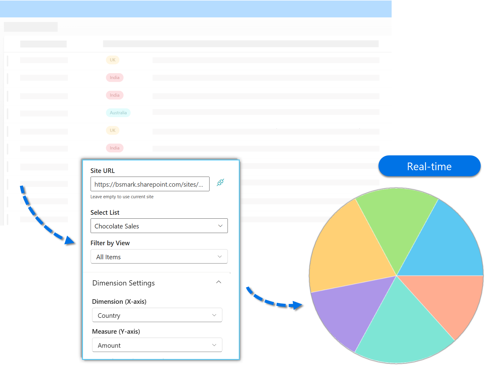
Connect to a SharePoint list or library containing the data you wish to visualize.
Assign columns to categories, values, and series to instantly transform data into a chart.
Fine-tune the chart’s appearance to match your branding and publish it to any SharePoint page.
Start with a free trial, then choose a subscription for a single site or your full tenant.
Secure Payment · 30-Day Satisfaction Guarantee · Support included
Explore BoostSolutions product user guides, tutorials, release notes, and more to get the most out of our products.
