Need a new way to present information on SharePoint? Are you visual person and need to see SharePoint list information visually? Do you have a lot of data and want a great way to condense and analyze it? If you are nodding your head vigorously then you need to take a look at SharePoint Business Charts, which will gives you a quick and easy way to create charts in minutes and help you to rapidly analyze data and make informed decisions.

Before we answer how Business Charts will help you, let us first take a quick look at some of the features you will get. With SharePoint Business Charts you have the option of choosing from five different chart types including bar chart, column chart, line chart, area chart and pie chart. You are not restricted in where you retrieve data from and can access data from multiple external data sources to generate charts, including SharePoint lists in different site collections or farms, MS SQL and ORACLE, making it simple and easy to analyze data from other business applications. After finding all your data you can use several functions (SUM, COUNT, AVERAGE, MAX, MIN, etc.) to manipulate, aggregate, sort, summarize and analyze your data. Other functions including filtering and comparing. The best part of SharePoint Business Charts is that you can use it directly in list or add it to your page as a web part, both options allowing you to customize your charts.

Here are two examples where you can use SharePoint Business Charts.
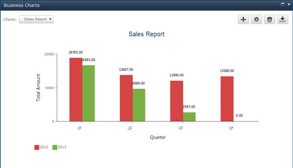
For organizations that have a number of products or product lines, they may want to track the sales of these products. With SharePoint Business Charts this is very easy. You can look at the sales of different products for one time period or over a certain time period like a week, month, quarter or year. This gives you a great visual so as to see if products sales are doing good or not. You can also compare data to see how your sales are doing by quarter from the previous year and this year.
Is it just for sales information? No, you can use Business Charts beyond sales. Let’s say you use SharePoint in your school, you can use SharePoint Business Charts to compare test scores of individual students, compare average test scores by semester and year, look at test scores by subject area to understand if there are areas where students need improvement, and so on.
How about other industries or businesses? Sure the sky is the limit. If you are using SharePoint and want a better, fast and easier way to present you data visually instead of in list form then you definitely need to give SharePoint Business Charts a try.
Please email us if you have any comments or questions: inquiry@boostsolutions.com.